Cropping Images

At this stage of the module I have been reviewing images for some time looking for ways to further my work in alternative avenues whilst painstakingly trying to edit work into sequences. In my attempts to move work forward I decided to experiment with cropping images with the intention of seeking broader and more abstract messages. 

Cropping was an interesting activity and something relatively new in a personal sense. I am used to making slight adjustments to work in order to straighten and make slight amendments. However although heavily cropping images is a technique which I find rather scary, some of the results were rather pleasing. I sought feedback from some of my peers on the course who commented that an energy was added to the work. An observation to which I agree however caution is needed with taking this approach further towards a possible inclusion in a portfolio. 

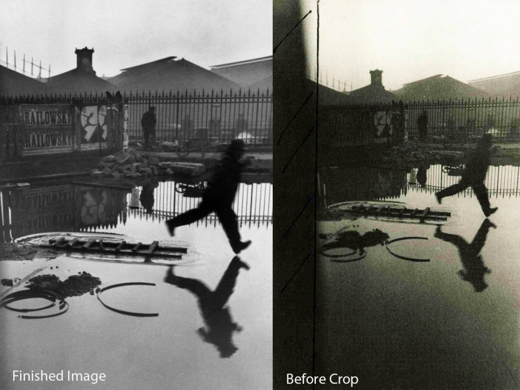
Upon research in this area it was interesting to learn of the Cartier Bresson and Elliot Irwitt’s use of cropping. The Irwitt image is subject to a particularly heavy cropp with the effect of making a much stronger image. 

Cartier Bresson | The Decisive Moment
Elliott Erwitt | Contact Sheet
Andrew Findlay | Cropping Example 1

Contextual Research | William Christenberry

In the search of trying to further contextualise my work and find meaning within my intent. I have conducted a broad range of contextual research, looking at the various approaches of photographers whose work resonates. An example of this, is the work of William Christonberry. For some time I have been contemplating his work amongst others with a very loose interpretation of their approach when shooting my own work. 

William Christenberry | Green Warehouse, Newbern, Alabama, 1984.

Photographing buildings and structures has formed a large part of my intent within this module however I often overlook such work when editing as I see these types of photographs as being without romance and totally banal which I fear represents my own failings and lack of objectivity, possibly looking at the work of the likes of Shore and Christenberry I am enchanted by the American landscape. The weather, colour and landscapes transport one to a phantasm of what life would be like if I lived in a similar location. On assessment of this module, looking at the quite brilliant compositions of someone such as Alex Webb, I fear that my obsession with composition has clouded my judgement. I feel that I am able to say this as Christenberry’s focus on the vernacular of his home serves to encapsulate a sense of veracity within his work. Romero in Christenberry (2013:p9) writes ‘Christonberry constructs an account of the South of the United States from within that South’. Romero’s statement here resonates with my own approach as my current work puts me at the centre of an insular community and in my subjective viewpoint of that community. With this in mind I am drawn back to the vernacular buildings photographed by Christenberry and upon lengthy contemplation, I am led to argue that I feel the work of Christenberry as opposed to awning over it in the way I might with Alex Webb. In feeling this work, I am able to take a sense of peace from many of his photographs and am able to enjoy and recognise, not the place, but the peace I take from someone photographing their home. The vernacular of home and with total confidence that the work evokes a powerful response. Philosophically, I am now looking at my own work in order to prepare myself for the presentation. And the work of Christenberry is important to me in the sense of someone working and reflecting a place that they know and understand. 

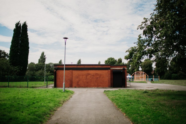
Andrew Findlay | North Reddish Park

When reviewing work of this nature I am conscious that the aesthetic associated within my photographs is often very grim. In terms of colour I am often uncomfortable with presenting so many images of grey concrete, I am also rather board of the colour green in my football pictures. However, the choices I have made to date, I feel are reflective of the community that my biographical narrative is intending to create. When I consider my formative years as a child growing up within this place, I think about the sense of adventure, I was also hopeful that my future wouldn’t feature these places and a sense of getting off the estate was certainly an ambition I had from an early age. Making regular visits back to some of the places I spent my childhood, I no longer feel like an active part of the community although I certainly know this community. The act of revisiting invokes a sense of what my life was like but isn’t anymore. 

Christenberry, W (2013) William Christenberry. New York, Foundation Mapfre.

Stephen Shore | Uncommon Places

When considering the work of Stephen Shore, I have owned the book Uncommon Places for around two months however at my current stage of heightened awareness of photographic philosophies, the task of engaging with the book with a clear mindset felt almost impossible. Although this post is based on my experience of the book, I feel that at this moment in time, the best I can do is consider the work of Shore in comparison with other contextual research I have engaged with throughout the surfaces and strategies module.

The book itself conforms to that of a catalogue with each image titled with the time and place. This is useful as the viewer is able understand the techniques or phase of experimentation that Shore was engaging with at the time. Schmidt Wulffen writes in Shore (1982) about the presentation of the book ‘viewers step into a specific place defined by Shore. In this way, the audience becomes involved in uncommon places, which can also be be seen as a biographical experiment’. Such comments make the decoding of the photographs more revealing, understanding the range of formats Shore utilised throughout different periods of his career in order to develop and take his work in different directions. Exemplifying what Shore states is his grammar of photography, flatness, frame, time and focus. Figure 1 is an example where this emphasis shifts with the focal point no longer arranged from the centre of the frame (Shore, 1982). Although still identifiable as a Shore image due to the semiotic union (Culler 1982) of the road markings, colour pallet of the cars which are juxtaposed, in addition to the sky which provides a surface to emphasise the building in the background and the street lamps. The color blue contained within the sky provides a richness which is synonymous with his work. Bringing the image together by creating a relationship between the background and foreground. What I really enjoy about Shoe’s work is the sense of boldness within his use of colour, being able to identify combinations and use them to create something that is quintessentially American and although dealing with the vernacular, he is able to create a sense of ‘being there’ transporting the viewer to another place in space and time. When contemplating figure 1, I am further drawn to the edges of the frame, in the omissions of the building to the left of the image and the blue vehicle to the right, we are unable to see what these elements look like, however Shore provides enough information for the viewer to make these connections for themselves. Being largely unable to view the opposite side of the road creates a tension which is universal. The sense of danger of being near a busy road and possibly the thoughts and feelings of how one might cross the road.

Figure 1 | West Market Street and North Eugene Street, Greensboro, North Carolina, January 23, 1976

Within these considerations it may be important to summarise and consider Shore in relation to my research of Eggleston and Alex Webb. All of whom are currently informing my work in the sense of thinking about composition and colour. Their relationship in terms of their relevance to my own work. Webb commenting on his pursuit of busy images that fall short of chaos (Webb 2014) in addition to Eggleston who has spoken of the use of the Confederate flag as a guide to composing his images. The images below I hope reflect the infomed context my work is taking. At present I am beginning to think carefully about the choices I make and will attempt to encompass what I have learned about the work of Shore in my shoots this week. One of which is a couple shoot away from my project however I am looking forward to experimenting in a different environment away from the current space I have been working in. 

Andrew Findlay | Creating Busy Images

Culler, J (1982) Culler, The Persuit of Signs, Routledge, London.

Eggleston, W. (2002) William Eggleston’s Guide. New York, The Museum of Modern Art.

Shore, S (1982) Uncommon Places, Thames and Hudson.

Webb, A and Webb, R (2014) On Street Photography and the Poetic Image. Aperture, New York

Six by Six Webinar | Craig Easton and Colin McPherson

This week I attended an online webinar with Craig Easton and Colin McPherson who are members of the 6 by 6 photography collective. The purpose of 6 by 6 is to ‘start conversations, debate and grow a network of documentary photographers in non traditional spaces’.

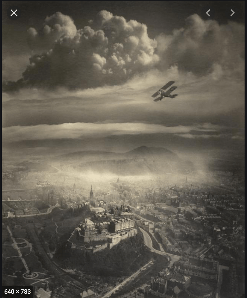
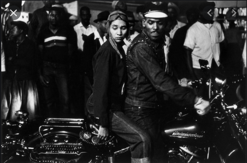
The specific webinar that I attended was entitled ‘Desert Island Pics’ and took the form of an interview between Easton and McPherson, whose task was to discuss 6 of his favorite photographs explaining why they were so important to him. The opportunity to listen to a working photographer who is relatively local to me was an excellent opportunity and on a human level, it was good to gain an insight into his influences. The first photograph that was discussed was Alfred Buckman’s ‘Areal View of Edinburgh’. McPherson spoke quite emotionally regarding this photograph explaining how it evoked his childhood and memories of growing up in the same place. This was interesting in relation to my own project as I have gravitated towards taking photographs in an area where I spent my own childhood. For reasons associated with objectivity, I felt that this was unstable ground for my own research project and in exploring my feelings deeper about this, I am led to consider my own feeling and motivations. As McPherson moves on to discuss an Image taken by Robert Frank, he refers to the idea of being an ‘outsider’ and how Frank was an outsider when he took the photograph. An idea that resonated with me to some extent on a range of levels. 

Alfred Buckman | Areal View of Edinburgh

Although my project is rooted in the place where I spent my childhood, I very much feel like an outsider when in the area of Reddish which is peculiar as I still have many connections. This led to deeper reflection as to why I feel this way. As a result I began to consider my own connections with the location, my own relationship with the project theme of lower level football and the connection I have not yet challenged which is the influence of my Father. As a child, playing football, my biggest supporter in addition to my biggest critic was my Dad. Born in Glasgow, adopted to a family in Motherwell, a small town outside Glasgow, my Dad left the army and arrived in Manchester with a friend who convinced him of opportunities for work in the area. I was always curious about my Dad’s lack of connection with Scotland and although he was a proud Scotsman, he spoke of family but never really appeared to have any close bonds with them. 

In later years of his life he often spoke of the importance of ‘putting down roots somewhere’. A piece of advice that I will always remember. And a statement that is revealing itself to be a statement which is important about my own intentions in the sense that the project is about my own feelings of being an outsider as my Dad clearly felt. 

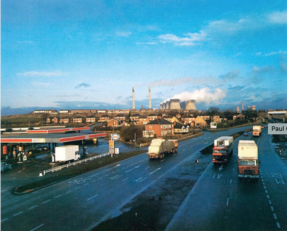
Paul Graham | Great North Road

Moving on with the webinar, McPherson then began to discuss an image taken by Paul Graham from his project ‘The Great North Road’. A stunning photograph which has echoes of Stephen Shore. McPherson made a number of pertinent observations about how the photograph made him feel. In relation to the light in the background, McPherson referred to the photograph as being ‘animation by light’ which I thought was a poignant remark and an excellent assessment of the use of light and colour in the photograph. Further comments referred to the sense of momentum and progress from the vehicles toward the right of the image. Upon initial research of the work of Graham, I am drawn to his excellent combinations of composition and colour in addition to his vernacular subjects. McPherson on a number of occasions referred to the craftsmanship of photographers that inspire him. The subversion of conventions as illustrated in the work of Robert Frank, light and metaphor in the Paul Graham image in addition to the vernacular landscape and decisive moment encapsulated in the Jeff Wall image ‘Sudden Gust of Wind’. The discussion inevitably turned to the constructed nature of this image with some debate over the ethics however I agreed with McPherson in the assumption that the intent and the vision of making something spectacular out of the vernacular and banal.

Robert Frank | Indianapolis 1856

To conclude this post, I really enjoyed the webinar and being part of something not directly associated with the MA course offered an element of freedom to think and listen without the burden of trying to get as many notes as I could. It was useful to listen to Easton and McPherson talk passionately about their influences and it served as a really good example of working photographers speaking in a photographic vocabulary that I am now becoming confident with. Reading the images while still very much learning but with a new, informed method of contemplation.

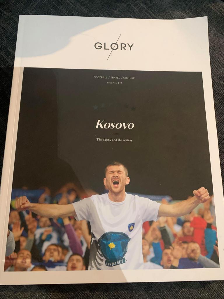
Glory Magazine | Contextual Research

Looking at the various surfaces I could potentially exhibit my project I have explored exhibition and photobooks which could be described as quite formal modes of exhibition. In researching publications and zines such as When Saturday Comes in addition to traditional childrens football annuals such as Match and shoot I found that a popular theme is to pay homage to the past, using retro fonts associated with a scoreboards and elaborate montages of images with text wrapped around in all manner of ways, very busy with space at a premium. 

In researching the football publication ‘Glory Magazine’ I found that this product breaks most of the popular conventions mentioned above. The website describes the magazine as a  ‘high-end football and travel publication, aiming to put the ‘beautiful’ back into the beautiful game.’ This assertion is quite accurate and is reflected in a number of ways. 

The material of high quality card and a matte finish provides the owner with a sense of value, the main image is framed nicely, emulating a window which invites the viewer/reader to explore the journey within the magazine. Black text provides the brand identity which has more in common with a wordstamp as opposed to a traditional mast head with the title simply the location of which the issue is about. The positioning phrases of ‘Football / Travel / Culture’ serve to further the subject themes to be expected of the content inside. Finally. The presence of six stars which appear to be spot laminated further reinforce the claim of being a high end product.

The theme of clean white space, simple framing and text layout draws similarities to what one would expect to see in a gallery. Further alluding to the potential audience of this publication. 

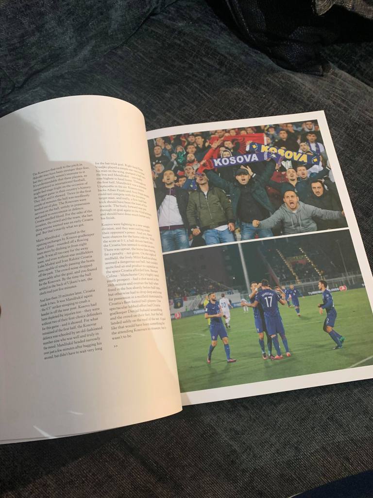
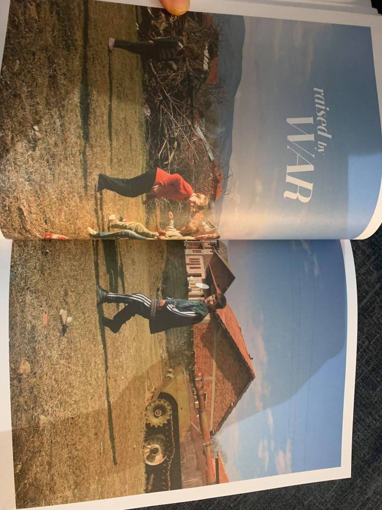
Looking inside, the magazine takes the form of an illustrated and written journal of the producers, they document their experience of travelling through the country, attending various football matches. White space again dominates the pages, text presented with a serif font and usually positioned in the middle of the pages. Sometimes using two columns, often using pull quotes. Occasionally texts is place on top of larger images which is done tastefully with minimal distraction to the main subjects. Illustrations of football pitches, team line ups and old football boots also serve to enhance the verisimilitude of the magazine. 

Some pages are shortened and when placed together, make up a broader image, in this case the crest of football team with famous player profiles written on the back. This again furthers the high end market. Having referred to a high end market regarding this magazine/zine some major questions arise such as. who might the audience be? Colberg writes that understanding the audience of a photobook will determine the concept of the book (2017:47). This makes Glory Magazine interesting as the text is very different from similar publications. The quality of the paper stock is high in addition to other aspects highlighted above. The photographs serve to create a narrative where the viewer is restricted in what photographs they look at via the use of pages, supported by lengthy text which explains the thoughts and feelings of the composers. Image and text work collaboratively in order to create a travel journal in a reportage style which enables the viewer to consume a broader experience of what the producers experience was. In one sense, the magazine is a photobook, in another sense, the magazine is a journal which documents a person’s experience of time and space. Colberg (2017:45) makes reference to duel elements when considering the concept of a photo book which are ‘the photography in question’ in addition to ‘the form of the book’. In this case I would argue that in the case of glory Magazine, a third element should be considered which is the text encompassed within the book. The reason for this is related to the consumption of the magazine which has over 50 documentary and portrait images which are contextualised and supported with written testimony. 

The length of the text impacts on the consumer experience as It creates an immersive read sometimes supported by photography and vice versa. In a personal sense, The selection of content makes the consumption a difficult experience. I argue this as an invested participant of the subject matter, having consumed the text, the photography was at times secondary which detracted from the photography rendering a confusing experience. This led to the consideration of my own position as a potential audience of this product. A collector of mainly catalogue style photobooks due to my economic position, Happy to pay around £50 for a book, Glory magazine priced at £10 is slightly on the expensive side and in no doubt due to the production costs. On reflection this may be justified as the magazine isn’t a quick read, and my experience was one of taking my time to read and look at it over the course of about a month. 

Due to the quality of production, I do get a sense of value in owning this product and the whole experience of consuming it encourages one to want to buy another. The result of this assertion leads to Glory Magazine is somewhat of a collectors item. It shares many conventions of a photobook in addition to written content one would expect to find in the supplement of a quality newspaper. It is designed with a visually literate audience in mind aiming the text at a niche audience within the boundaries of the mass market appeal of football fans. 

Glory Magazine (2016) Issue 2. Self Published. Glory Mag.

Colberg, J (2017) Understanding Photo Books, tHE form and Content of the Photographic Book. London, Routledge. 

Contextual Research | Lartigue

Going back to my one to one with Cemre, she highlighted that it may be a good idea to encompass action into my work in addition to shooting from the perspective of of a child. As a result, I have been researching the work of Lartigue which I find compelling in addition to having similarities with one of my favorate photographers, Rodney Smith. As my reserach furthered I found that much of Lartigue’s work was driven by ‘action’ with composition a secondary factor. Although I consider his black and white actioin work appealing what I really like about it is the combination of action and composition. I feel this is of vital importance to the development of my own project because what I would like to avoid is producing action shots of people playing football in a style that looks like a commercial or journalistic sports photograph. 

Lartigue’s cousin Simone Roussel, Rouzat, 1913.

The image above is particularly interesting as as stated earlier, the photograph is driven by the action of falling from the bike, the subject is placed in the middle of the frame but what I really find interesting about this image is the way that the stone path falls towards the right leading the viewer to assume that the subject was approaching a type of junction. This brings the image to life adding a narrative or even metaphor. Seconds earlier the subject would have been riding the bike approaching a type of crossroad which would require a type of decision to be made. ‘Right or Left’, the outcome of which the subject is evidence, could be a metaphor for making a decision. The image lacking colour does move away from my own approach however the union of action and composition serve as reference points on this occasion.

The image below represents an interest I have had for some years and have tried myself within a wedding photography context. Comparisons with the like of Rodney Smith are present here and what I am interested in is the symmetry of the subjects legs. Clearly creating an action pose of the subject running or possibly jumping.

Lartigue: Lady Playing Tennis
Rodney Smith

The Smith image about echoes the work of Lartigue and one is able to see the similarities in the two images. In the photograph taken by Smith. The action is still driving the photograph in addition to the presence of clear daylight between the subject the ground. The image of the tennis player doesn’t appear constructed as does the photograph taken by Smith which may be another consideration I will need to contend with.

Moving on to the work Lartigue produced in colour, his emphasis shifts towards environmental portraits mainly of women.

Lartigue | Life in Colour

The image above is dominated between the action of the water and the vantage point. The diving white diving board adding a further layer of interest which achieves excellent separation from the deep blue of the water. I find the photograph bordering the glamorous however the relationship between composition, colour, vantage point and ‘action’ achieving a union charged with the poetic.

Websites

Smith, R (2020) rodneysmith.com [Online] Available at: https://rodneysmith.com/surrealism/ (Accessed 5th July 2020)

The Guardian (2020) ‘Jacques Henri Lartigue: portrait of the photographer as a young man’ (The Guardian) 29th March 2020, Available at: https://www.theguardian.com/artanddesign/2020/mar/29/jacques-henri-lartigue-portrait-of-the-photographer-as-a-young-man (Accessed 5th July 2020)

Contextual Research | Photo Books

As the subject matter of my project begins to emerge I have begun to consider how I would disseminate my work. In response to this aspect of the project I am required to think about who the audience would be and how they would consume the project. In a previous post I have briefly considered the idea of an exhibition at the local football club. However the purpose of this post is to consider in further depth, the merit of producing photobook. And if so, begin to consider who the type of audience I am attepting to engage with in addition to considering the type of potobook that I would like to produce. Colberg, J (2017) makes some important distinction between these types of objects defining them into three different categories: Albums, catalogues and monographs. On first thought, each catogary described by Colberg has merits and potential regarding my project. The idea of an album style photo-book may lend itself well to my project in relation to a project which is about archiving fan images that are acquired. 

(2017: p2)  ‘Conceptually, a photography album is a very specific photo-book. It usually is made over time reflecting, say, person’s or family history. Its producer edits it by selecting some photographs over others. In all likelihood, an album mostly contains happier, noteworthy moments in life. in this sense, albums are items of personal propaganda.’ 


Colberg’s comments lend themselves well to the idea of creating a nostalgic football album. The book would conform to the idea of a type of ‘personal propaganda’ about the football club, fan images of groups of people, Christmas presents of new football kits being opened with the photographer storing scanned fan photographs on a website before selecting the most appropriate photographs to feature in a book.


Similarly, a catalogue may encompass the collecting and storing of images, however the presentation of this type of book may conform to a summary of the work produced throughout the project with less of an emphasis on an emotive theme such as happy memories or a narrative. 


On the subject of a monograph, a photobook of this nature would be heavily relient on the vision of the photographer using the mediums as a form of visual comminucaiton in order to convey a message with supporting text being subordinate to the photographs Colberg (2017). In engaging with this type of photobook, the work I produce would become central to the project with little or no participatory input. This would change the appeal to a potential audience moving it away from the ideas suggested above. 


Colberg, J (2017) Understanding Photo Books, tHE form and Content of the Photographic Book. London, Routledge. 

Open Eye Gallery | Exposure Project

Building on the feedback from the webinar this week with Michelle. I decided to further my research into the work of Emma Case, whilst doing this I am also mindful of the upcoming briefs for week 5 of the module.

In response I decided to do some online research into curatorship as I feel that it is an area that I feel is currently a weakness. Whilst conducting research I managed to identify a webinar which was published a month ago by the Opon Eye Gallery. The webinar contained Emma Case and Katherine Monaghan who were discussing their socially engaged project ‘Exposed’.

The project involved a range of workshops where participants were able to use whatever devices they had in order to identify ‘different ways to photograph, and ‘different ways to enjoy photography’ with the intention of generating an insight into the the life of others. 


Watching the video, I felt this approach was relevant to the week 3 theme of participation and and collaboration. As a result i begun to consider what type of this project this alligns with in relation to the ideas of Lapenta (2011) who sets out the main types of collaboration project:

Respondent-generated image production

Community-based image production

Collaborative or participatory image production

The exposed project encompassed elements of all of these approaches however I felt it alligned mostly with a ‘community based image production’.  Lapenta (2011) outlines this type of collaboration

‘participants collectively assess their own images, highlighting what the community feels is most significant or best, often through dialogue and storytelling.’

Case and Monaghan’s project encompassed photo walks and trips to local parks and cities in addition to some show and tell sessions where participants were able to tell a story about a photograph they had taken.

Both Case and Monaghan agreed that these sessions enabled participants to develop their photography vocabulary in addition to developing their eye as photographers. The nature of this approach also served to build participants confidence by working within a supportive envirenment. In doing this, participants were also able to collectively assess their work Lapenta (2011) by expressing feeling about the work produced and its relevance to the community the participants inhabit. 

As a result of researching socially engeged projects I am beginning to rethink my role as a photographer and consider how I can utilise, not only the work I create but my understanding of photography to enrich the lives of others.

Up to this point I have been quite selfish with my work and my intent however, going forward I will endeavour to be much more open about my work and understand the power I have to enrich the community. Allowing this to inform my intent I feel that being more open will enable the possibilities of my work to be informed by much more more than my own narcissistic vision. 

Going back to the Exposed project and the Open Eye gallery, Barker, E (1999) highlights the importance and the potential impact of such organisations when she argues that

 ‘public museums and galleries… Justify their share of goverment funding by demonstrating that they function for a benefit of a broad public rather than a prvalidged few and make collections as accessible as possible.’

The Exposed project does this by not just offering an accessible space, but reaching out and stimulating the community in order to generate a local voice whilst encouraging engagement and learning. Understanding that the gallery goes beyond the exhibition space. 

Barker, E (1999) Contemporary Cultures of Display. London, The Open University Press.

Lapenta, F. (2011) ‘Some Theoretical and Methodological Views on Photo-Elicitation’, in: L. Pauwels & E. Margolis. eds. (2011) The SAGE handbook of visual research methods. (Los Angeles: Sage), pp. 201–213.

Open Eye Gallery (2020)  A Spotlight On… Emma Case & Katherine Monaghan (Socially Engaged Photography Network). [Online] Available at: https://www.youtube.com/watch?v=W6NVkykEXS8 {Accessed 28th June 2020).
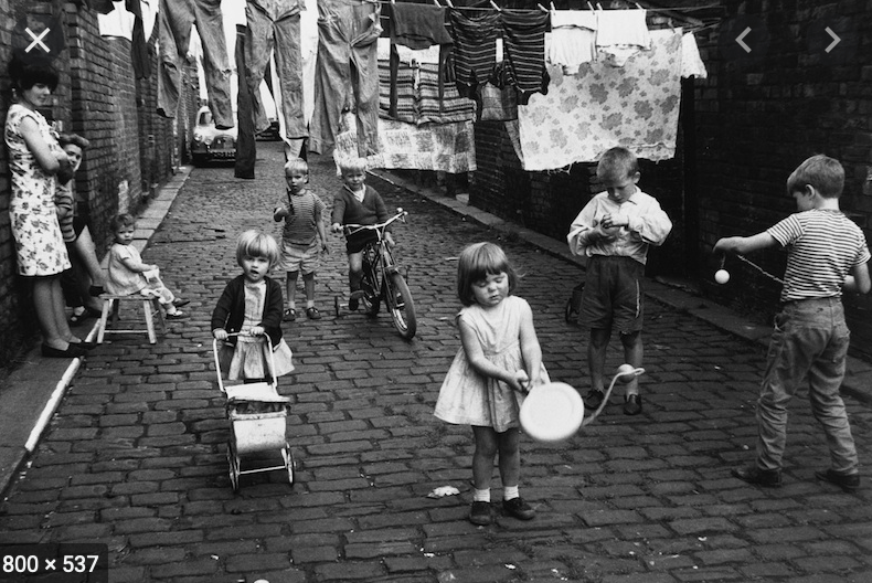
Contextual Research | Shirley Baker

Furthering my contextual research into street photographers in order to broaden an understanding of poetic images. I spent the morning looking at the work of Shirley Baker who was a Manchester/Salford based street photographer. Much of her work focussed on the inner city slum clearences of the 1960’s. She made photographs mainly of the women and children who inhabited these spaces at at time of change, where communities were uprooted to new purpose build spaces which encompassed large estates and tower blocks.

 Looking at her photographs I couldn’t help but notice that much of her work is very busy, often with multiple subjects and interesting objects and textures. All of which serve to produce a compelling narrative about what life was really like in this time of transition. Although very different, I see similarities in the work of Alex Webb who suggests about his work that he looks for compositions that stop just before chaos. When reviewing the work of Baker I observe a similar type of energy. The multiple narratives which are tied together within the time of transition of a place that is home. The black and white work of Baker is interesting and useful personally, as her understanding of composition is a little clearer to see in her black and white work. 

For someone such as myself going through a process of completely rethinking my approach to composition. Bakers work, and voice is clear. The energy which is where the enjoyment I take comes from is in no doubt as a result of Bakers understanding of composition and the black and white nature of her work has allowed further contempleation of how to address this element of photography within my own work. As suggested earlier, reviewing the work of Alex Webb is useful however his use of colour in conjunction with composition if first of all, brilliant, however when developing a critical contextualisation of my own practice. Baker’s work has been really useful. 

Furthermore, as the surfaces and strategies module moves into the idea of curatorship. I have identified Natasha Howes who is a curator based in Manchester. Further research will be conducted into her work and ethos will be useful going forward. 

Baker, S (2018) Without a Trace: Manchester and Salford in the 1960s. Gloucestershire. The History Press.

Week 4 | Webinar with Michelle Sank

Reflection Week 4 Webinar 

Another useful webinar with Michelle this week. My intention this week wasn’t necessarily image based. The area I am currently struggling with is the intent of my project. At present, the documentary approach towards my work I feel is becomming somewhat one dimensional. Therefore it was good to consult with my peers and tutor to identify approaches and methodologies to opening up my project whilst making the intent of my work more concise.

I am relatively pleased with the development of my practice and feel that strategies of looking are becoming more mature as a result of contextual research in addition to guidance from Michelle. 

I recently contacted Julian Germain with regards to seeking some guidance on my project. His response was brief but he did highlight the work that he felt was strong. 

The main benefit of the webinar was the identification of Emma Case and the project ‘Red’. Red is a participatory project which collects and archives fan photographs of Liverpool fooball club. Not of the football but of the culture and surrounding experiences of fans. As Liverpool have a rich legacy in the history of European football the project encompasses lots of interesting memories. The project also encompasses the work of Case herself who possesses a documentary style which is appealing in terms of her use of colour and composition.

I was also led to consider a project I looked at at in the early stages of the course. Humans of New York states the intentions of the project… 
‘The initial goal goal was to photograph 10,000 New Yorkers on the Street, and create an exhaustive catalogue of the city’s inhabitants’.

At present I am reserching the structure of these projects in order to formulate a type of structure to my own. One of the key considerations will be whether to continue with a range of football teams and locations or focussing on just one football club which would be Stockport County. The club already have a number of organisations and supporter groups but most point towards  what happens on the pitch. There are many social media groups which already act as a type of archive however I see this as an opportunity to connect and raise awareness of my project. 

In terms of the direction of my work. When and if spectators are allowd to attend football matches. My approach will be to frequent public spaces in and around the stadium in addition to attending away matches which will provide different aesthetics. I will contact Emma Case in order to seek advice about the project in addition to formulating a type of mission statement and rational. As agreed, I will send this to Michelle in the coming days.