Looking at the various surfaces I could potentially exhibit my project I have explored exhibition and photobooks which could be described as quite formal modes of exhibition. In researching publications and zines such as When Saturday Comes in addition to traditional childrens football annuals such as Match and shoot I found that a popular theme is to pay homage to the past, using retro fonts associated with a scoreboards and elaborate montages of images with text wrapped around in all manner of ways, very busy with space at a premium.
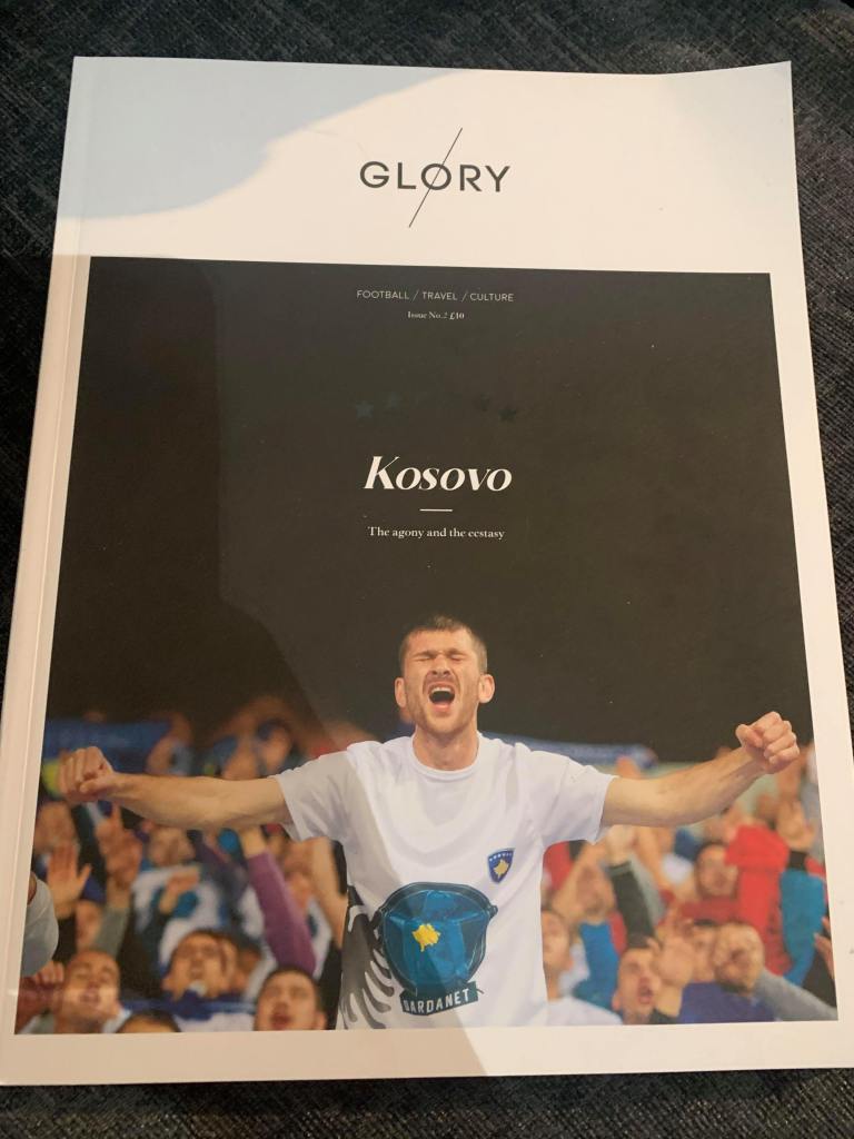
In researching the football publication ‘Glory Magazine’ I found that this product breaks most of the popular conventions mentioned above. The website describes the magazine as a ‘high-end football and travel publication, aiming to put the ‘beautiful’ back into the beautiful game.’ This assertion is quite accurate and is reflected in a number of ways.
The material of high quality card and a matte finish provides the owner with a sense of value, the main image is framed nicely, emulating a window which invites the viewer/reader to explore the journey within the magazine. Black text provides the brand identity which has more in common with a wordstamp as opposed to a traditional mast head with the title simply the location of which the issue is about. The positioning phrases of ‘Football / Travel / Culture’ serve to further the subject themes to be expected of the content inside. Finally. The presence of six stars which appear to be spot laminated further reinforce the claim of being a high end product.
The theme of clean white space, simple framing and text layout draws similarities to what one would expect to see in a gallery. Further alluding to the potential audience of this publication.
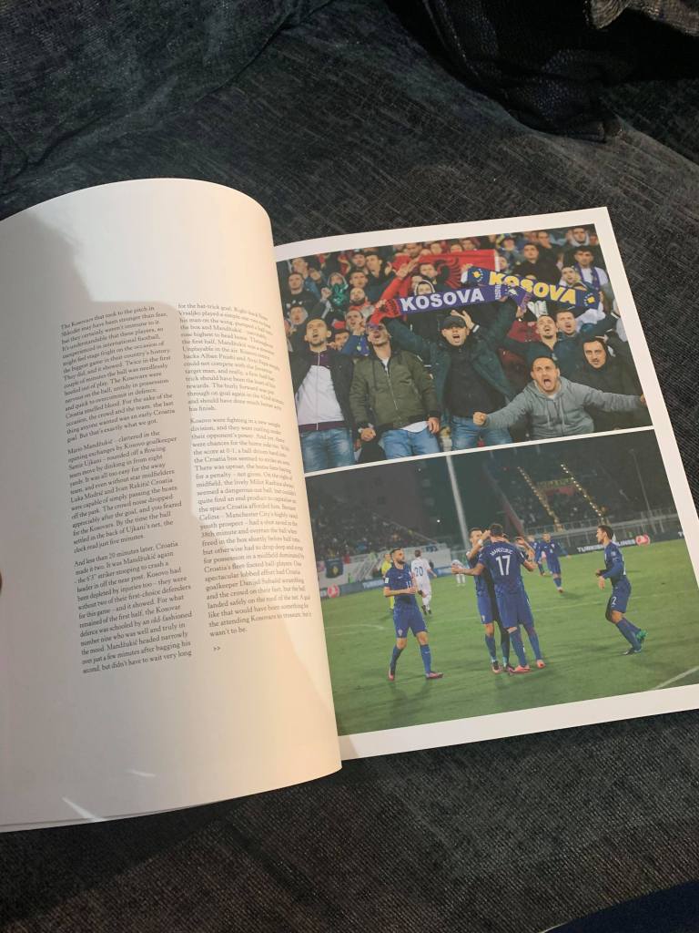
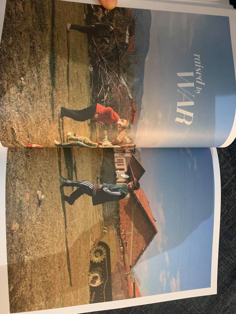
Looking inside, the magazine takes the form of an illustrated and written journal of the producers, they document their experience of travelling through the country, attending various football matches. White space again dominates the pages, text presented with a serif font and usually positioned in the middle of the pages. Sometimes using two columns, often using pull quotes. Occasionally texts is place on top of larger images which is done tastefully with minimal distraction to the main subjects. Illustrations of football pitches, team line ups and old football boots also serve to enhance the verisimilitude of the magazine.
Some pages are shortened and when placed together, make up a broader image, in this case the crest of football team with famous player profiles written on the back. This again furthers the high end market. Having referred to a high end market regarding this magazine/zine some major questions arise such as. who might the audience be? Colberg writes that understanding the audience of a photobook will determine the concept of the book (2017:47). This makes Glory Magazine interesting as the text is very different from similar publications. The quality of the paper stock is high in addition to other aspects highlighted above. The photographs serve to create a narrative where the viewer is restricted in what photographs they look at via the use of pages, supported by lengthy text which explains the thoughts and feelings of the composers. Image and text work collaboratively in order to create a travel journal in a reportage style which enables the viewer to consume a broader experience of what the producers experience was. In one sense, the magazine is a photobook, in another sense, the magazine is a journal which documents a person’s experience of time and space. Colberg (2017:45) makes reference to duel elements when considering the concept of a photo book which are ‘the photography in question’ in addition to ‘the form of the book’. In this case I would argue that in the case of glory Magazine, a third element should be considered which is the text encompassed within the book. The reason for this is related to the consumption of the magazine which has over 50 documentary and portrait images which are contextualised and supported with written testimony.
The length of the text impacts on the consumer experience as It creates an immersive read sometimes supported by photography and vice versa. In a personal sense, The selection of content makes the consumption a difficult experience. I argue this as an invested participant of the subject matter, having consumed the text, the photography was at times secondary which detracted from the photography rendering a confusing experience. This led to the consideration of my own position as a potential audience of this product. A collector of mainly catalogue style photobooks due to my economic position, Happy to pay around £50 for a book, Glory magazine priced at £10 is slightly on the expensive side and in no doubt due to the production costs. On reflection this may be justified as the magazine isn’t a quick read, and my experience was one of taking my time to read and look at it over the course of about a month.
Due to the quality of production, I do get a sense of value in owning this product and the whole experience of consuming it encourages one to want to buy another. The result of this assertion leads to Glory Magazine is somewhat of a collectors item. It shares many conventions of a photobook in addition to written content one would expect to find in the supplement of a quality newspaper. It is designed with a visually literate audience in mind aiming the text at a niche audience within the boundaries of the mass market appeal of football fans.
Glory Magazine (2016) Issue 2. Self Published. Glory Mag.
Colberg, J (2017) Understanding Photo Books, tHE form and Content of the Photographic Book. London, Routledge.
